Brand website for the developer
Industry:
Real Estate, Construction
Client:
International developer Teus Group
Goal:
Brand website
Year:
2025
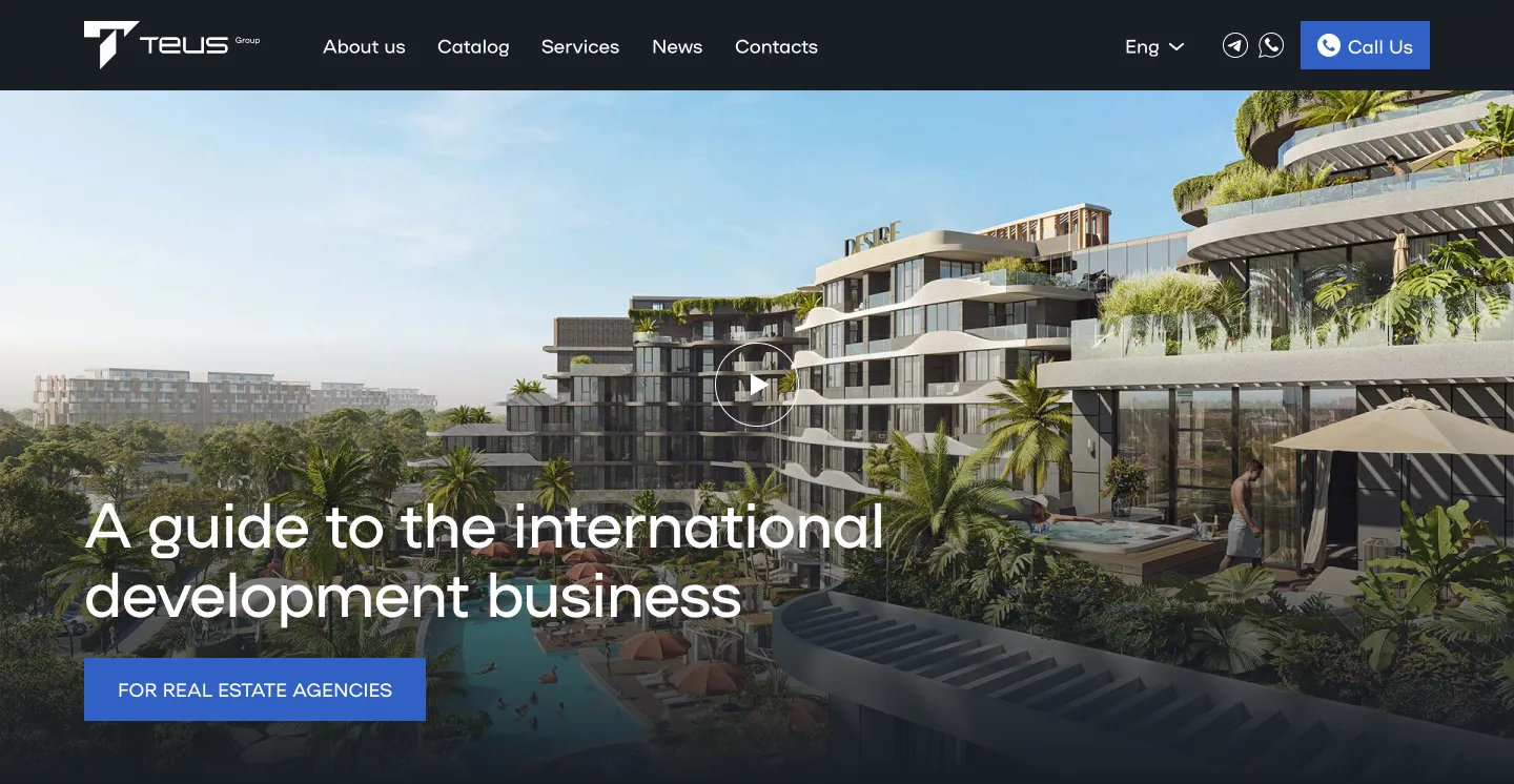
Intro
We met the client a few months before the start of the work. Then, at the stage of selecting contractors, we very consciously and responsibly approached the elaboration of the customer's detailed vehicle, which became the main reason for deciding in our favor
The initial request of the client was the sequential implementation of two independent projects: the actual, discreet corporate website of the developer's company and the seductive image landing of a hotel complex in Bali, the construction of which the client is completing. Projects were unrelated to each other, and deadlines (as is often the case) were tight. Therefore, a separate design/development team was involved for each website.
Core task
turnkey website
Services:
UX/UI Design, Webflow Development
Tools & technologies:
Figma, Photosop, Webflow, Javascript, GSAP, Splide, Lenis, jQuery
The task
Development of a corporate website and brand landing for a hotel complex in Bali within one site in 4 different languages
- Multi-page corporate website with discreet interactive and advanced marketing functionality: CMS for news with convenient filtering and dynamic catalog of real estate for sale.
- Fascinating image landing for the promo of a premium hotel complex. Airy, original and full of modern animation.
- Ensuring the functionality of data collection, processing and transfer to the CRM system of the client
- Localization in 3 additional languages with the possibility of image localization, url and automatic version determination depending on the language of the user's browser
- Full-featured Cookie Consent (GDPR Compliance)
- Connecting analytics systems and setting up events for major advertising and analytics platforms.
- Adaptation to widescreen monitors, tablets and mobile devices
- Cross-browser and cross-device testing
Stage # 1
UX, structure, wireframe
We always start with these basic steps. The customer provided text content for the main page and we started working on the wireframe, in parallel working on the overall structure of the entire project
In the studio, we always make detailed warferries so that the customer can see the prototype as close as possible to the final result and understand whether all the meanings he wanted to convey to users are taken into account


Homeopage wireframe
Stage # 2
Design concept
The client already had a working design system and visual identity. So we needed to follow the rules that had been created. but try to make some interesting solutions
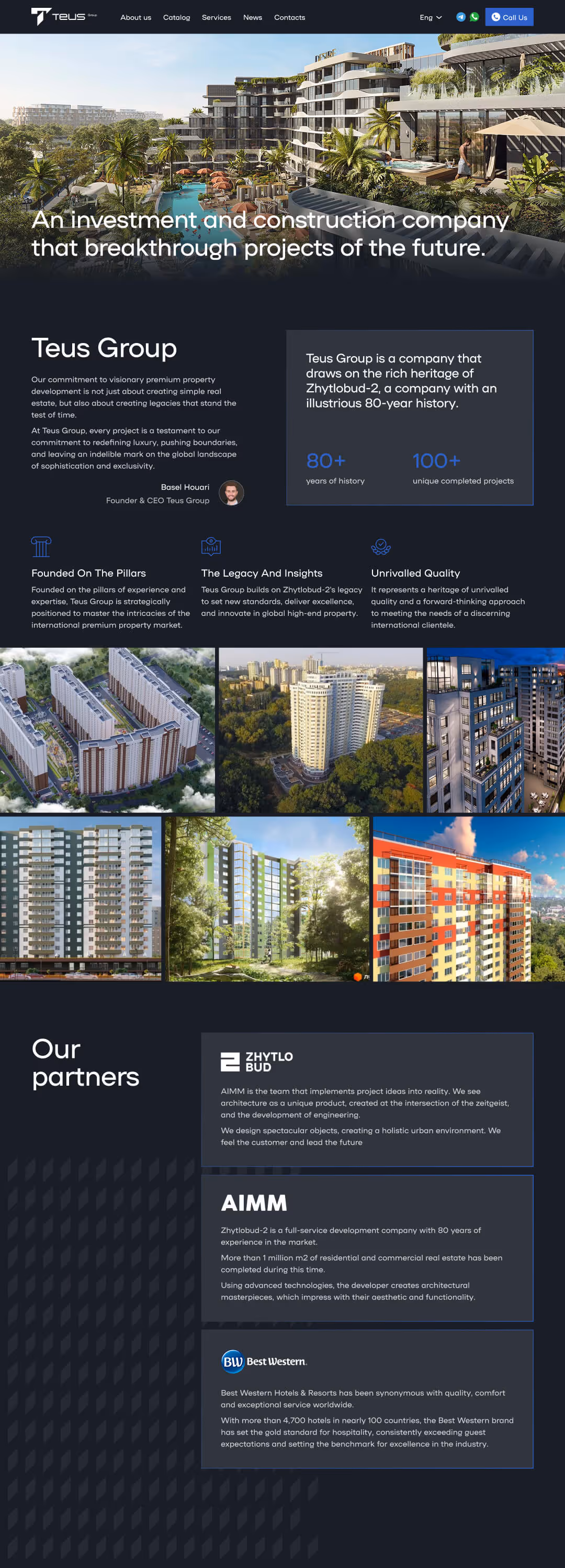
Based on warframe and references, we developed two design concepts and presented to the client. The client chose the one on the dark background and we started the process of cutting the layout to the perfect state
Two Proposed Concepts
Stage # 3
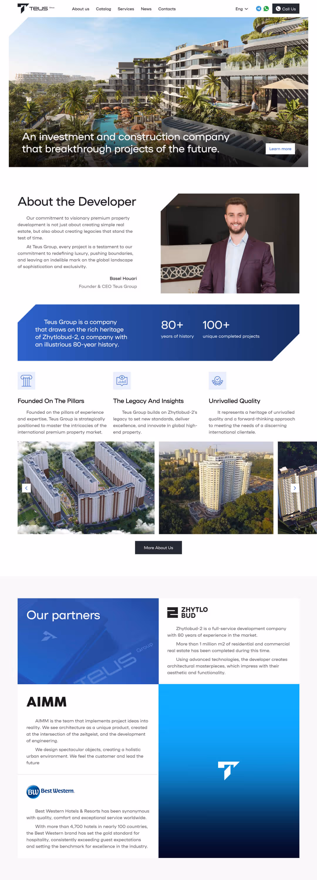
Entire website design
The approved concept received minor changes in the course of work, but over time the entire layout was completed, along with all the necessary components: menu for tablet and mobile phone, 404 page, popups, OG image, favicon, webclip, etc. Different states have also been worked out for all interactive elements


Stage # 4
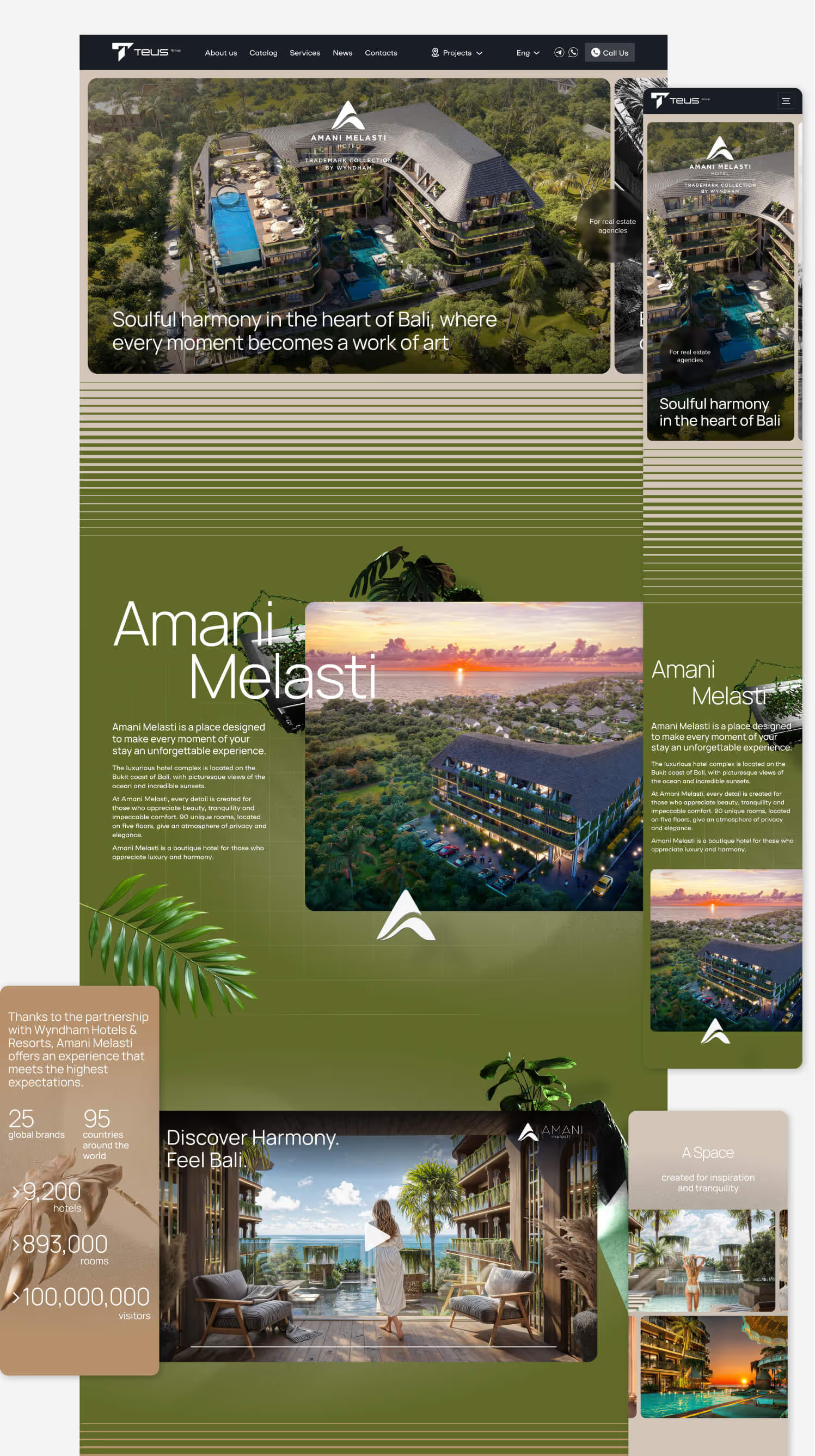
Design of a separate landing page for a new building
This project was to have an exciting design. Airy, original and full of modern animation. We did it in several iterations. First, a conceptual design was drawn. At this stage, the designer had complete freedom of action.
The first surprise:
The client had an unexpected need to launch a production landing project in support of their own marketing campaign within the framework of an international presentation. All in all, we had 4 days:
- Create a complete design according to the concept
- Adapt or generate temporary renders
- Complete a landing page with a length of almost 30k pixels
- Connect data collection to CRM system
- “Plant” on the hosting and connect the domain
After the design was approved, there was a joint call with the development team and the designer had to “comb” the layout and give it consistency for ease of development. The week was busy. Of course, we and the client knew that this was a temporary solution. Nevertheless, we managed and the client was able to get a real benefit from the landing page. We were pleased, because we work primarily for this.
Part of the homepage layout
Stage # 4
Project architecture
We started the development with a thorough design of the architecture of the corporate website. We defined a stack of technologies for the implementation of functional modules and chose a methodology for naming classes. Created a comprehensive style guide that contained all service classes for headers, text blocks, buttons, and images. The base and secondary colors were implemented through CSS variables, and the layout type was defined as rubber with mobile adaptation.
At the same time:
The design concept of the landing of the hotel complex was approved. It turned out to be really non-standard, airy and inspiring. And completely unlike the corporate website of the developer. It should have been so.

Project workspace
Continuation of work
The works moved in a planned direction.
The corporate website was in its final stages. We have already completed the layout with adapters. Continued work on functional modules:
— international format for entering numbers with automatic identification of the user's country by ip
— data validation/validation of data of inputs/ui disabled states
— generation and processing of additional parameters
— integration with CRM
— localization
— analytics settings
— Implementation of Cookie Consent
The second surprise:
The client decided to combine the corporate website and the landing of the hotel complex in a single project. In fact, the task is very non-trivial if the leautes are completely different, and they have to be supported from the same admin. Plus, being on a single domain still obliges us to adhere to a certain degree of consistency. Otherwise, such inconsistency will not be perceived as a feature, but as a bug.
However, we love non-standard tasks and took on this immediately and with inspiration. We had to:
- Make changes to the design of the basic components of the corporate website and landing (header, footer, language panel, mobile menu, modal windows and forms) in order to partially align them with each other
- At the same time, we felt the need to unify these components to a certain extent, so we used slightly modified variants of components for landing. At the same time, all changes implemented in these components on the corporate website were automatically implemented on the landing page.
- All the functionality of the corporate website has also been integrated into the landing
- Leayouts, breakpoints and styles were also frame-agreed
- All libraries for animation on the landing page were connected separately for the page, so as not to affect the overall performance of the website
Motivation
Master class on motivation
For the corporate website and landing page, there were different delivery terms. But they, given the organized processes and the number of works, were quite concise. And the quality requirements are at the highest level. Therefore, the client guaranteed the team a crate of the best beer for strict adherence to the release date.
As a result, we took 2 cases of beer from the mail. Despite many difficulties, in compatibility with the client, we fulfilled all tasks in a timely manner. At present, we maintain friendly warm relations and enjoy the uncompromising satisfaction of the client from the project and cooperation