Multi-Page Website for Webflow Tutor School
Intro
This project proved extremely demanding because the client was… ourselves, as Ambi co-founded Webflow Tutor. This situation created additional challenges because we not only had a clear vision of the final result, but also set high standards for every aspect of the project
At the initial stage, our school offered only one beginner-oriented course. Yet, over time, we have expanded the range of educational products, enhanced the educational process, implemented a high-quality feedback system, modernized our platform, and launched new courses for various skill levels.
Eventually, we created a unique ecosystem for learning Webflow development that meets the modern market demands. However, as the school grew, it became obvious that our old website – a simple landing page – no longer met our needs. It didn’t reflect the scale of our operations, the premium nature of our products, and the high quality of our services.
Thus, we decided to carry out a full rebranding of the school’s online presence and create a new, multi-page website. This project needed to serve as both our business card and a powerful tool for attracting new students, showcasing our achievements, and providing easy access to all educational products.
Core tasks
redesign
Services:
UX design, UI design, Webflow Development, LMS
Tools & technologies:
Figma, Photosop, Webflow, Javascript, GSAP, Splide, Lenis, jQuery
The task
When you're learning how to build websites, your own website shouldn’t just be a showcase – it should be the proof of your expertise and leadership. That’s why we set ambitious goals for both aesthetic perfection and functional excellence.
- Sophisticated design. A preliminary survey confirmed that our students care about how an educational website looks. Therefore, we aimed for abdesign that radiated confidence, demonstrated our expertise and leadership in Webflow education. Every detail was meant to emphasize the premium nature of our product, leaving a lasting impression.
- Tablet and mobile adaptation. Today, most users browse from mobile devices. We made full optimization a priority, ensuring the site looked perfect and worked seamlessly on smartphones, tablets, and laptops.
- Support and scalability. As our school is constantly evolving, we frequently update content, add courses, and build new product pages. The website needed to be flexible and easily scalable, allowing quick edits without involving developers.
- CMS and content filtering. We regularly publish articles as part of our educational content strategy. The website needed a convenient interface for filtering articles by category, topic, or other criteria, along with well-structured, dynamic article pages and social sharing options.
- Exquisite animations. We aimed to create perfect animations making the website experience unforgettable without overwhelming the user – adding the wow effect and elegant touches to harmoniously complement user interactions.
- Automation. The school receives frequent inquiries from potential students and partners. To streamline this, we needed to automate request processing – including publishing sample messages in messengers – to save time and simplify communication.
These tasks laid the foundation for building a website that not only meets our high standards but also exceeds our clients' expectations.
Step 1
UX, structure, wireframe
We set out to design an intuitive interface with clear navigation. Every website element needed to be logically placed, so users could quickly find what they were looking for. Simplicity and convenience were the cornerstone guiding our UX decisions.
We mapped out the website structure to understand the full scope, then drafted a text prototype for the homepage. We searched for visual inspiration from reference websites.
We interviewed six people who had taken online courses during this stage within the last six months. These interviews revealed valuable insights that helped us shape a relevant, meaningful structure and highlight key messages.


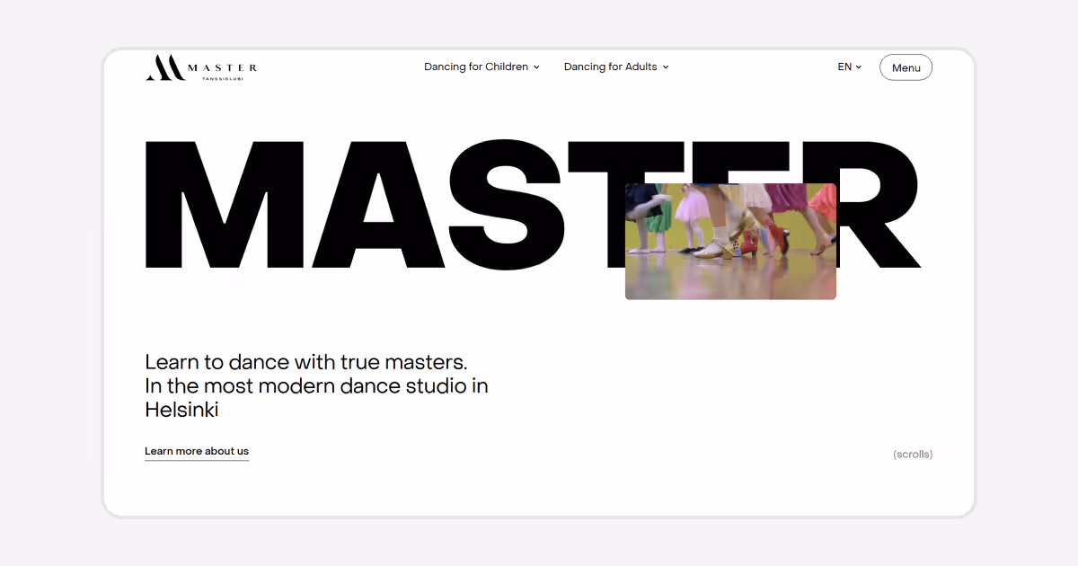
The school's old website

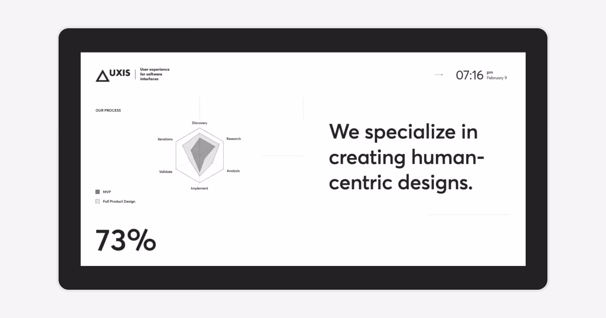
Detailed wireframe for the school’s new homepage
Step 2
Create custom graphics
For this project, we created custom illustrations to emphasize the uniqueness of our design. They were crafted with their future animation in mind, adding even more dynamics and interactivity to the website.
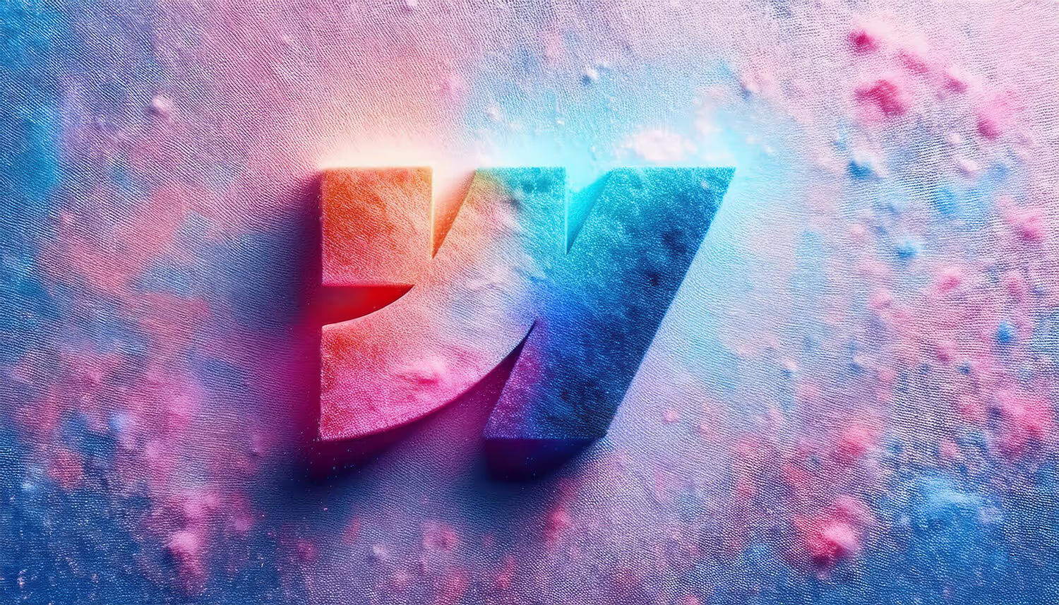
In addition, we created custom graphics from the Webflow logo – it was a long but interesting process.
- Logo-based graphics. We generated unique visuals with Adobe Firefly based on the Webflow logo.
- Video generation. With Runway, we turned those visuals into videos and then upscaled (enlarged) them to meet the requirements for the website's launch.
- Lottie from PNG sequences. We converted each video into PNG sequences to create Lottie (JSON) animations. This allowed us to trigger animations using any events (in our case, it was the page scroll) for a dynamic user experience.
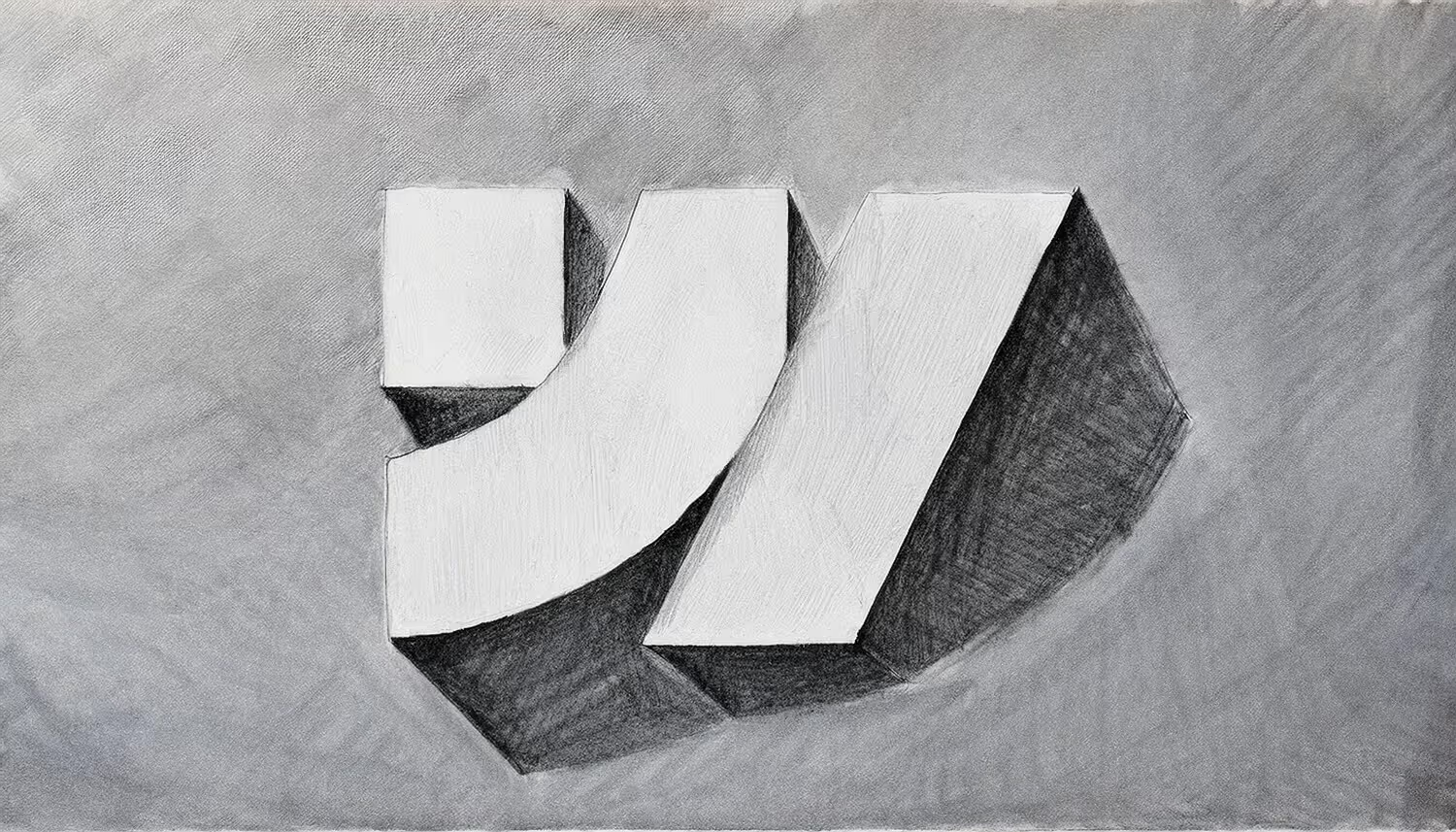
You can check out the stages of creating the graphics for the new website below.

Custom illustrations for educational course covers


Generated images
Generated videos
Step 3
UI Design
For a while, we searched for the perfect visual style. Our new designer, Alex, joined the team and brought fresh ideas. Together, we found exactly the concept we needed.
Next, we scaled the concept across all pages and developed a style guide for consistent design implementation. Some pages featured complex layouts, so designers worked closely with developers to ensure feasibility.
We gave special attention to recurring content (like reviews, alumni, and case studies) to maintain a clean and user-friendly interface and visual integrity. After finishing the desktop layouts, we adapted all designs for tablets and mobile devices.


Example of a page with complex layout
143,050
Content pixels across static pages


Step 4
Webflow development
Before starting, we carefully selected our tech stack and the class naming methodology to ensure structure clarity and maintainability. We built a detailed style guide covering all elements – headings, buttons, images, etc. – to establish consistency and integrity across the project.
Each module (menus, FAQs, forms, navigation) was developed individually based on user needs and project specifics.
We prioritized responsive design by defining breakpoints for 1366, 1440, 1920, and 2560 pixels, using a flexible grid system (“rubber” design) and container fixation starting at 1460px. This approach provided design flexibility and a comfortable user experience on any device.
Some sections required special layout logic, for example, combining single-side container fixation and content with no fixation at all. This required custom solutions to adapt polished content display across all screens.
These nuances were extremely important both aesthetically and to showcase unique Webflow capabilities in layout control. This approach allowed us to demonstrate Webflow’s full potential in precise element arrangement within a modern, sophisticated web design.

Project workspace
CMS
CMS and Filtering
We designed dynamic article pages with a classic layout, prioritizing functionality over flashy visual effects. Our primary objective was to deliver valuable content through an intuitive filtering system that enhances the user experience. This approach has proven successful – users can now efficiently locate relevant materials based on their specific interests and needs. The streamlined design ensures that content discovery remains straightforward and accessible for all visitors.
Structure and content component
We've dedicated significant effort to developing a well-structured, comprehensive information resource that showcases our educational programs. Our platform does more than simply catalog courses – it also highlights the school's community engagement while providing seamless functionality for users to contact us, sign up for new products, log in to your personal account or purchase the desired course.
The platform serves as the central hub for our entire educational ecosystem, featuring an extensive collection of free resources, guides, and supplementary materials. This approach helps to fully grasp our capabilities and values while fostering a sense of belonging to our learning community.

Database for CMS collection of articles
Animation
Animation
Despite Webflow’s native animation features, we implemented most interactive elements with GSAP. By the way, GSAP became officially integrated into the Webflow ecosystem in 2024, opening up even more opportunities for developers.
All animation scripts were hosted via third-party CDN for easier version control, stability, and project support.
We decided not to overload the site with animations, focusing on key UI elements like rapper titles and custom hover effects to add dynamic flair.
Consistency was crucial in terms of interactive elements. After all, there is nothing worse than animations that stylistically do not match. Thus, each animation was carefully designed to complement others, ensuring a harmonious and holistic user experience.
Of course, animation is best experienced firsthand, so feel free to explore the website, not just read about it.
Hoover animation on course cards
Menu animation
Hoover effect examples
Finale
Project completion
The total duration of work on the project was 10 months. The result of our work was dozens of glowing student reviews, an easily scalable platform, and a strong brand representation online with a polished website.
We increased conversion, and most importantly, delivered a project we’re truly proud of to the most demanding client – ourselves.