Creating a Logo, Visual Identity & UX/UI Corporate Website Design
Industry:
LegalTech
Client:
Law Firm Providing Part-time In-House Legal Services for Growing Businesses
Goal:
Visual refresh
Year:
2024
Intro
Add.Law is a London-based law firm that offers part-time in-house lawyer services for growing businesses. Their approach integrates experienced lawyers directly into client teams, providing flexible and cost-effective legal support without hiring a full-time in-house lawyer.
In this project, we acted as a design contractor for our partner, UXIS. All communication occurred directly with their team, ensuring a stable workflow. All participants were fully engaged and committed to achieving the best possible result.
Key tasks
identity
ux/ui
Services:
Logo creation, visual identity, UX/UI design
Tools & technologies:
Figma, Photosop, Illustartor, Relume
The task
The client presented the following requirements for their identity and website:
- Modern, minimalistic logo, with the “+” sign integrated in it
- Ease of use of the site with an intuitive interface
- Modern design: professional and aesthetic appearance for the website and identity
- Mobile Adaptation: optimizing website design for mobile devices
Stage # 1
Research & logo development
Visual identity work started with research and logo development.
One of the important insights gained during the research concerned competitors' color palettes – most used the blue spectrum. To help the client stand out in the market, we offered alternatives with green and red colors. Ultimately, green was chosen.
We prepared four concepts for the logo. The client quickly selected a favorite, asking only to refine the typography. You can see the results below. 👇


We proposed 4 logo concepts; the client selected the first one

The selected concept with modified fonts


Final logo and sign
Stage # 2
Visual identity
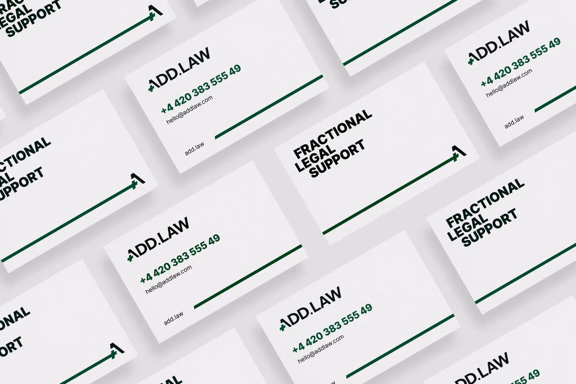
We developed the visual identity within a 2-week timeframe. It included the following components: logo, sign, colors, fonts, graphic elements, rules for using the logo, visual style for photos, and graphic techniques for using the identity in media. Most importantly, we created a comprehensive guide that described all the rules for working with the identity. Additionally, we developed 7 media pieces that the client identified as the most important for launch.
The developed visual identity can be implemented by a graphic designer throughout the brand's lifetime thanks to the clear and detailed guidelines.
Below we show several pages from the guideline that illustrate these rules.
Branded colors
The color palette consists of the main green color used in the logo, plus 2 darker shades and 3 lighter shades. The palette also includes all shades of black from 0 to 100 percent saturation. We use lemon as an accent color.

Graphic elements
To maintain brand integrity, consistent graphic elements must be used across all types of media.

Graphic techniques
The following graphic techniques can be used in brand identity:
1. Highlighting part of the text with a different color and font (italics)
2. Offsetting individual words in the title
3. Dividing media into 2 or 4 parts
4. Using 1/4 of the plus sign as a photo frame
5. Extending the “plus” sign where needed
6. Using one of the graphic elements as a mask for photos

Interaction examples
Here’s how all these identity elements can work together:
1. Brand colors
2. Branded fonts
3. Graphic elements
4. Graphic techniques
5. Icons set
6. Logo


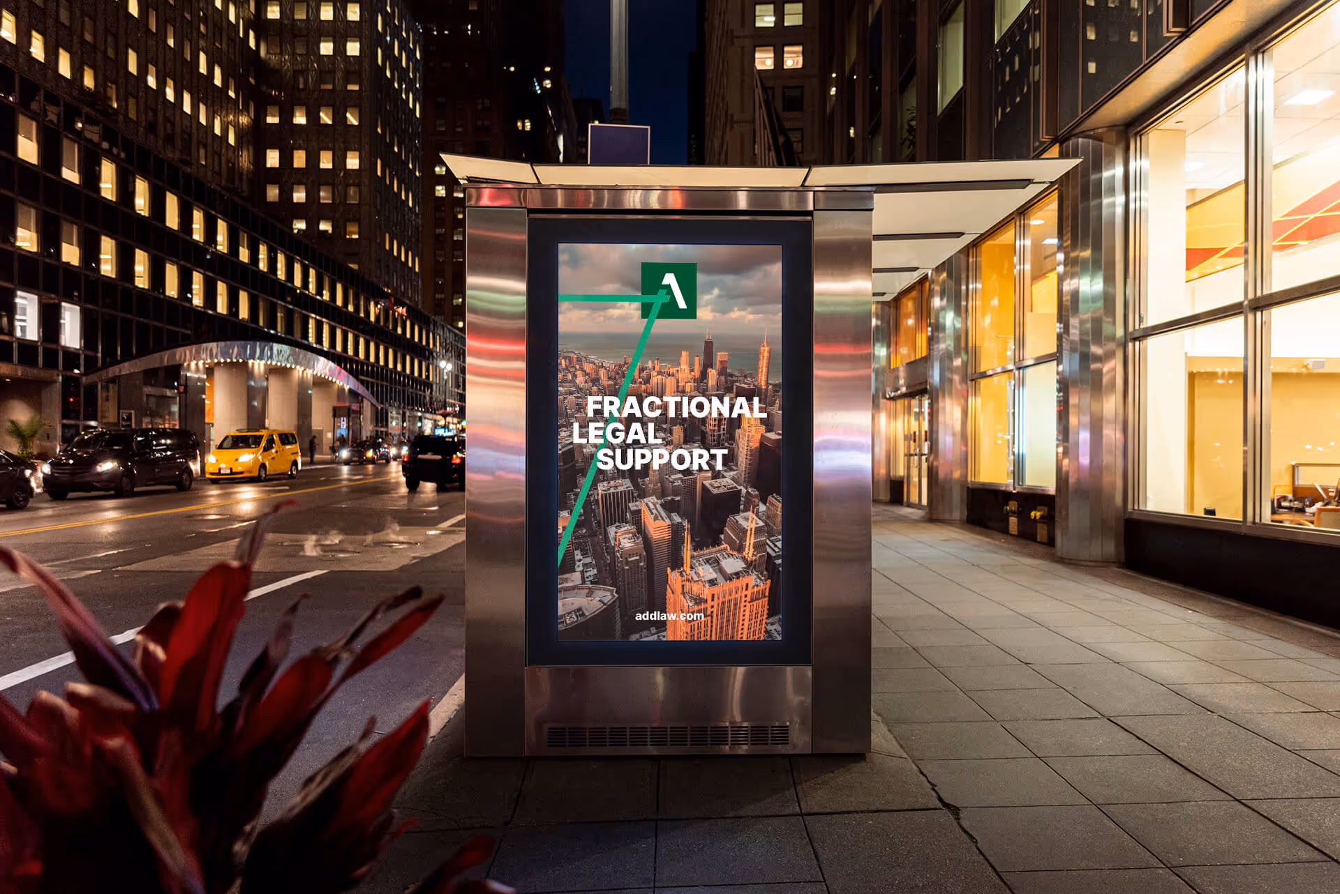
Visual identity displayed in various media
Stage 2 – Completion
Deliverables
Once we had completed developing the identity, we prepared all the necessary materials for delivery and uploaded them to the cloud. These files remain accessible indefinitely, allowing the customer to access the original files at any time.
The client received the following materials:
- All logo versions (main, sign, avatar) in multiple formats (jpg, png, svg, eps) and two color models (RGB and CMYK)
- All printed materials ready for production
- The style guide in a printable high-quality PDF and a lighter PDF file, designed for easier interaction with contractors and internal teams
- A dedicated Figma file with all color styles organized by pages for ease of use

Figma file with all identity elements
Stage # 3
UX/UI site design. Structure and prototype
When beginning the website work, we discovered that the client did not yet have all the necessary content. We addressed this problem using AI, specifically the Relume service. We created the structure and wireframes. The designer then refined the layouts to meet the client’s requirements.
Based on the created structure and wireframes, the client could prepare relevant content much faster. To launch the website faster, we decided to create five internal pages in addition to the main page. We postponed another 6 internal pages that were in the original scope to a later phase. After approval, we proceeded to creating design concepts.

wireframes
Stage # 4
Design concept
At this stage, we developed two unique concepts. The client approved one of them with slight modifications.


Two design concept

Part of the approved main page design


Project Completion
All layouts were delivered for development
Our involvement in this project concluded at the design stage, as our partners at UXIS handled the development. And they did an excellent job! You can view the live website here
If you want to learn more about our services in Branding, or ux/ui design, please visit the relevant service pages.