Developing a website for Finland’s largest dance & sports school
Client:
Master – dance and sports school
Goal:
Redesign
Іструменти і технології:
Figma, Photosop, Illustrator
Year:
2025 - now
Intro
Founded in 2014 in Helsinki, Master dance and sports school has evolved from a small studio to Finland's largest dance school. It became a training ground for both amateurs and future champions, with graduates winning numerous awards at national and international competitions.
However, despite the school's rapid development, its online presence had remained unchanged since its founding. The website was created on Wix and had an outdated design and limited content management capabilities. This no longer met the current needs of the school or reflected its status.
The owners decided to build a new website that would reflect their organization's scale and excellence while meeting modern user expectations.(звісно з дозволу клієнта) покажемо різномаіття задач, які ми встигли зробити за 3 місяці співпраці
Stage # 1
UX, structure, wireframe
We began by analyzing the school's existing website. We needed to thoroughly study the information architecture to ensure a smooth migration to the new website. Concurrently, we reviewed the technical specifications and the client's wishes for updating the structure.
Тиждень 1 — старт і перші концепти
Ми взяли два проєкти (корпоративні сайти) і одразу працювали над обома. Цей тиждень був про те, щоб зрозуміти естетику клієнта, очікування по стилю та спосіб подачі дизайну. Фактично — це був наш вхідний тест на смак, швидкість і здатність пропонувати різні напрямки візуального рішення.
- Project №1 — wireframe + 3 візуальні концепції
- Project №2 — wireframe + 3 візуальні концепції
25 годин

Site map, later modified during development
Wireframe і три концепції для другого проєкту
1 місяць
Занурення та зростання темпу
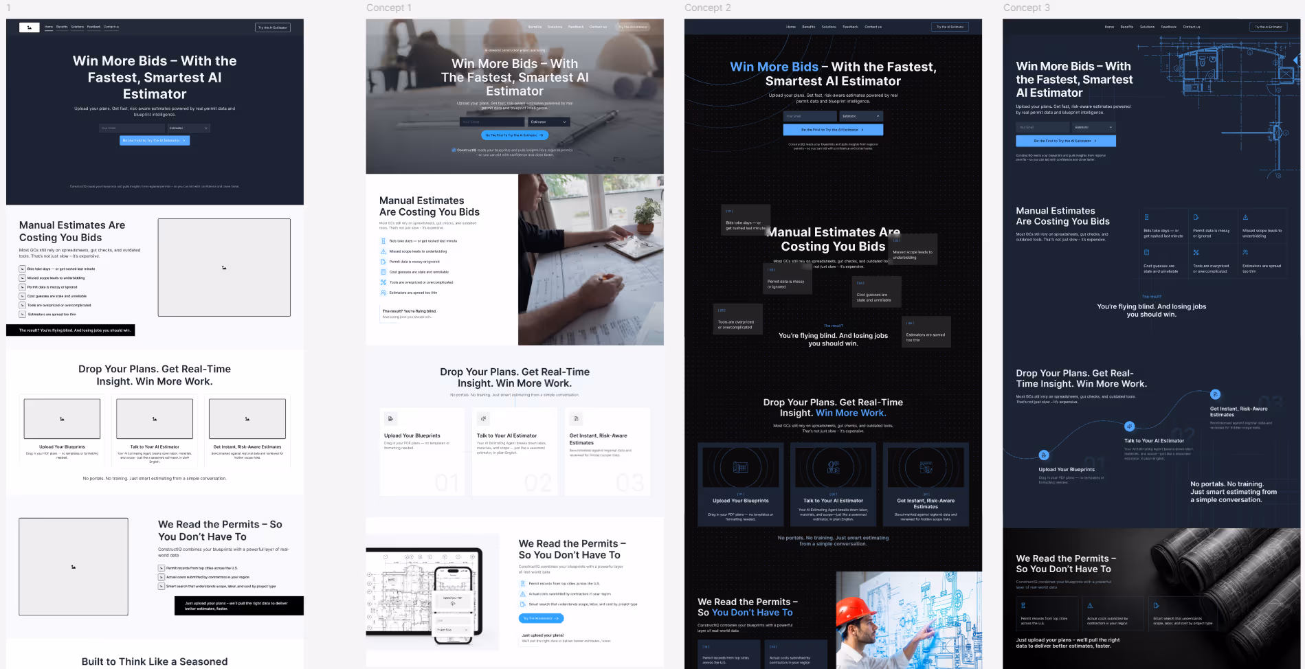
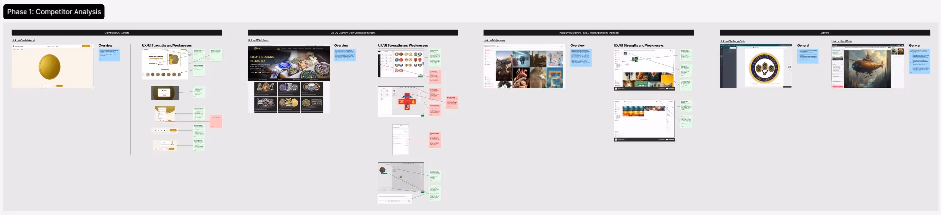
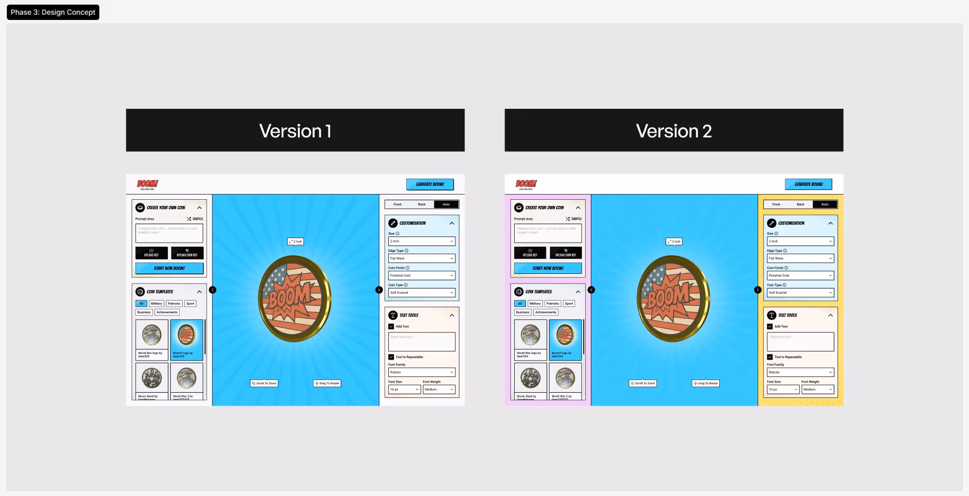
Коли базовий стиль і формат взаємодії стали зрозумілі, ми перейшли до глибшої роботи. Тут з'явився новий цікавий проєкт (№3), суть якого створювати дизайн монет за допомогою ШІ і потім ці монети користувач мав змогу замовити собі. Наша задача була вивчити конкурентів і розробити інтерфейс кабінету для цього продукту, на базі отриманих знань про ринок і нішу
Тиждень 2
- Project №3 — аналіз конкурентів, 3 варфрейми та 2 дизайн-концепти
- Project №1 — 7 повноцінних сторінок дизайну по обраній концепції
28 годин
Тиждень 3 — адаптиви та системність
На цьому тижні наш фокус був лише на одному проєкті (№1), бо там були стилсі терміни реалізації
- Project №1 — 3 нові сторінки та мобільна адаптація всіх сторінок
31 година
Project №1 - дизайн всіх сторінок з мобільною адаптацією
Project №3 - дослідження конкурентів і аналіз слабких / сильних сторін

Project №3 - 3 опції варфреймів з різним підходом до user flow
Project №3 - дизайн-концепція в супергеройскому стилі в двох кольорах
1 місяць
Великий проєкт наприкінці місяця
Останній тиждень місяця став найбільш інтенсивним, бо ми підхопили Project №4, у якого була нетипова ситуація. У клієнта вже існував сайт, але з часом він повністю втратив контроль над ним: немає доступів, немає вихідних файлів, немає можливості вносити зміни чи масштабувати сайт.
Щоб повернути керованість проєкту, ми взяли на себе повну реконструкцію дизайну. Через стислі терміни, над проєктом працювало одразу 3 дизайнери:
- Створили у Figma точну систему макетів на основі існуючого сайту
- Покращили де було можливо всі ключові сторінки та адаптували їх під мобільні пристрої
- Підготували структуровані файли для розробників, щоб вони могли стабільно продовжувати роботу без хаосу та пошуку візуальних рішень
Тиждень 4
- Project №4 — переніс 25 сторінок + PDF-документ з фіксацією покращень
38 годин
Загалом 1 місяць
3
Дизайнери були залучені
180,700
Content pixels across static pages
24,200
content pixels across CMS pages
Stage # 2
Design concept
This project was unique for us in many ways, including the design concept phase. Our client is both creative and systematic in their approach. For the first time in our Ambi’s history, we prepared 6 design concepts.
For each iteration, we presented 2 concepts. We received constructive, structured feedback – and proceeded with the next step. Our main goal was to create a quality product with which the customer would be 100% satisfied.
After deciding on the concept, were had several more iterations searching for the right color palette and fonts. As happens in 90% of cases, the color and font originally proposed by the designer were ultimately approved. The client was very involved in the process and was satisfied with this exploration. After the concept’s final approval, the designers celebrated with a glass of wine and proceeded to apply the concept across all pages of the website.
Stage # 3
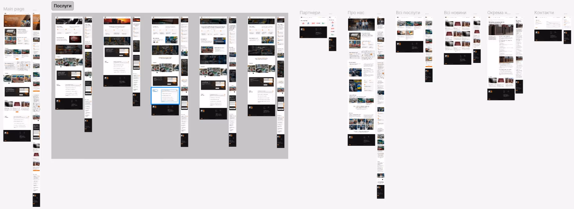
Designing all pages and adapting for mobile
This stage involved long and painstaking work, considering the number of web pages. The client experienced delays in content preparation, so the entire process took considerable time. But our team and the customer team successfully completed the task.
After creating all the layouts, the designers prepared a UI kit and approved references for animating key sections of the site. We then held a joint call with the development team and the customer to transfer all materials.


Stage # 4
Webflow development
The development began with defining the project architecture, the methodology for naming classes, and analyzing technically complex modules and non-standard animations. This was handled by the project team.
To ensure consistency and project monumentality, we created a style guide defining all service classes for headings, text blocks, buttons, images, etc. Before starting, it was important to determine the layout type and website behavior on different desktop devices (1440, 1920, 2560, etc.). Our approach was a “rubber” layout with adaptors at breakpoints. The maximum container width was 1380 pixels.
Static page layout took about 6 weeks. As always, after completing this stage, we submitted the project to the client for review. Based on their feedback, we performed certain edits.

Project workspace
CMS
CMS Design
Next, we started designing the Webflow CMS. The client didn't require complex CMS functionality, so we moved quickly. However, it was important to ensure maximum ease of use for a non-technical client. Therefore, everything needed to be as clear as possible. We named and described each database field. All secondary fields or those not intended for client use were specifically marked.
When the entire project was completed, we once again submitted it for client review. Yes, we prefer close interaction with the client to ensure:
- They remain calm, see work progress, and understand our current stage
- They stay emotionally involved in the process

CMS trainer collection database
Animation
Animated scripts
Last but not least, we created animation scripts. Traditionally, we used native Webflow animation and, of course, the GSAP library (for animating titles and main page screens). We also used SplideJS to implement sliders.
The project featured many sliders, each with slightly different functionality. Additionally, each slider that contained fewer slides than could fit on the page converted to a static block.
Project Timeline
Record project duration
The project includes 27 static pages and 4 CMS collections (with 4 unique dynamic pages). The total implementation took about 16 months, a record project duration for our team. This extended timeline was due to the client's particular workload and limited availability for providing quick feedback. Since client comfort is our priority, we adapted accordingly.
Curious about how deadlines affect project outcomes? Read our article: “Web Project Timelines: How Clients and Contractors Affect Deadlines.”
Finale
Project completion
We submitted the fully finished project to the client for the final review and received a response with additional requests, which took about 10 days to implement.
The client was satisfied with our work. We are proud to be able to be so helpful