Creating a logo and visual identity for an ice cream brand
Prerequisites
TM Ice Cream Shop is a 100% natural, high-quality and tasty ice cream. The history of the brand began back in 1992, in the wonderful city of Lviv. Since then, the family has been working in the field of making real ice cream. All these years they continue to improve the old ones, and introduce new ice cream recipes.
The company entered a new stage of development, which was also the impetus for updating the visual style, since the brand looked outdated and irrelevant. The customer turned to our partners - the creative agency Tequila Creative House, and we, as their design partner, joined the work on the renovation of the Ice Cream Shop.
Key tasks
logo
identity
Services:
Logo creation, visual identity, packaging
Istruments and technologies:
Figma, Photosop, Illustrator
The task
The client placed great emphasis on the naturalness of his product. This had to be reflected in the visual identification of the brand.
- Modern, minimalistic logo,in which it is necessary to add the year of foundation of the company
- Bright, attractive colorsso that the brand is associated with something joyful and pleasant
- Scalable identity. Together with the identity, we developed 14 different media — and that was just the beginning. As more materials needed to be created in the future, the identity had to be systematic, flexible, and easy to scale.
Stage # 1
Research, strategy
The standard process of working on visual identity in our studio begins research. This project was no exception.
One of the key insights of the study concerned the stylistics of the competitors' logos — most of them were distinctly “childish” in character. Although the main audience of consumers is children, the purchase decision is still made by parents. This became an important factor in the further development of identity. We tried to find a middle ground
Developed strategy
- A clear portrait of the target market and the buyers that the company is targeting.
- Key benefits for the audience, which became the basis of positioning.
- Unique strengths of the company and its brand.
Positioning
Ice Cream Shop ice cream is made for families who appreciate natural products and great taste. It offers a wide range of options with health benefits and quality concerns. And also for those who like to please themselves with non-standard and useful goodies.
Brand Message
Natural ice cream, real emotions
With the help of the advanced mudboard, we were able to understand which direction we need to move in order to get to the customer's expectations as accurately as possible

This is what the old logo looked like

Part of the logos of competitors from the analysis carried out

Mudboard assembled for the client
Stage # 2
Logo development
We proposed 4 different logo concepts, each of which was supported by a presentation, as revealed the potential of the logo in terms of identity. Among the proposed options, the client chose one and we developed it a little.

4 Proposed Concepts

Final logo
Stage # 2
Visual identity
We developed a visual identity with a 2-week train. We have chosen bright and friendly colors that have a beneficial effect on the arousal of appetite. And a soft curled font. Also an integral part of the identity were the promo heroes of Kuse-Kos and Lis-Lis. Identity has the following components:
- Logo
- Colors, fonts
- Graphic elements (icons, patterns, promotional characters)
- Rules for using the logo
- Graphic techniques for the use of identity on media
- And the most important thing is the guideline. This is a document that describes all the rules for working with identity.
Also, 14 media were developed, which the customer chose as the most important for the start of work. Implement a visual style, any graphic designer can be engaged in throughout the life of the business, using a clear and detailed guideline
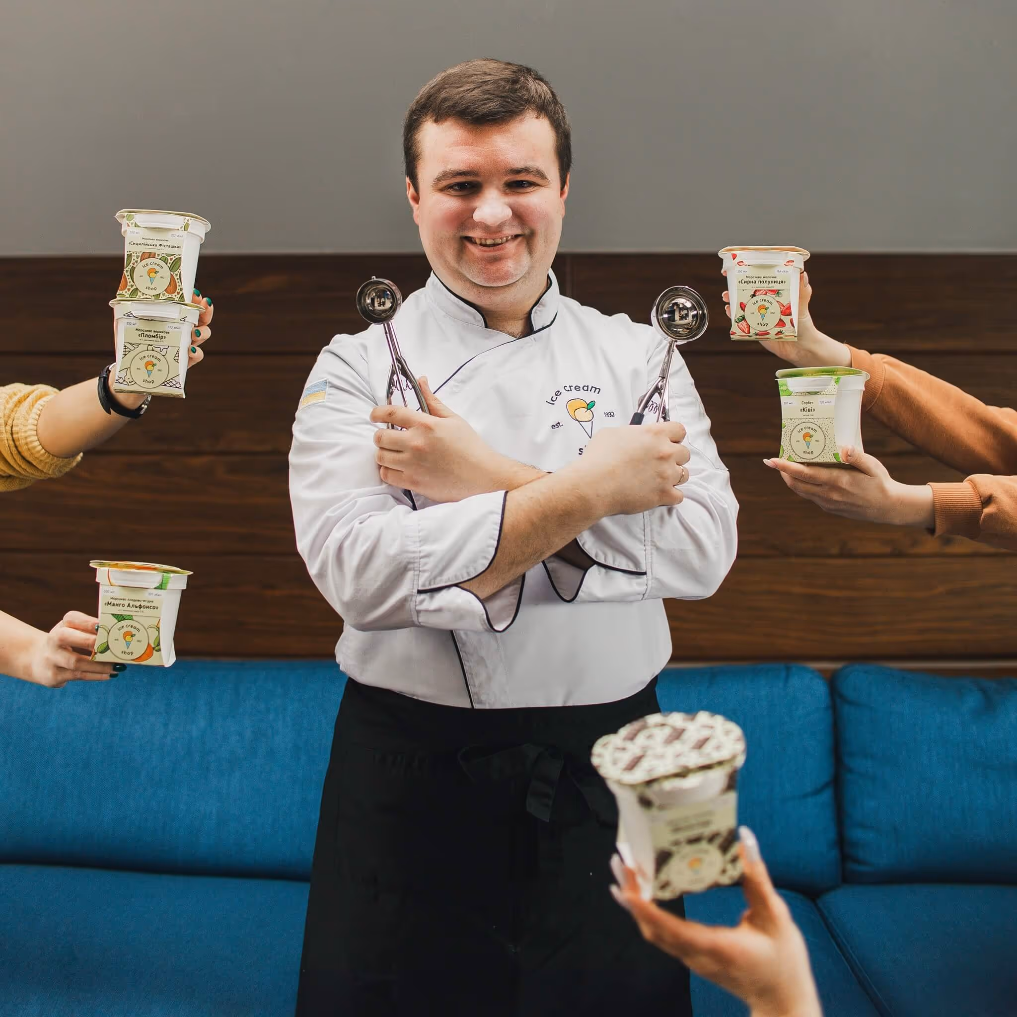
Since identity has been in use for a long time, we skip the mockup stage and immediately show what it looks like in real life.


Completion
Transfer of all materials
Once the identity development is complete, we prepare all the necessary materials for transfer and upload them to the cloud. There they are stored indefinitely and the customer can return to the original files at any time
The client receives the following list of materials
- All logo versions (main, sign, avatar) in multiple formats (jpg, png, svg, eps) and two color models (RFB and CMYK)
- All printed materials are ready for printing
- Guideline in printable PDF (in high quality) and for PDF made easy to interact with contractors and within the company
- Separate Figma file in which everything is collected by pages for ease of use. All color styles are also listed there
Brand Life
The brand has been successfully using the identity developed by us for 5 years — and this is the best confirmation of its effectiveness and recognition from the customer.
If you are interested in exploring our services in more detail with Branding, then welcome to the service page